Thursday, December 4, 2014

Blogger #WoahSoMeta

Entry 11, Due 12.4.2014
Terra System
M & M's Galaxy (Santa is real!)
Star Command, It's Been A Good Ride. Spaceship Now Pl0x

For our final entry, we shall be discussing the design of this website. Woah, so meta and spooky! 

So what stands out about utilizing Blogger (or, more colloquially, Blogspot)? Firstly, the ease of setting up is absolutely phenomenal. I had never done a blog before, and I set one up in about thirty seconds. It was so easy a caveman can do it! Secondly, the layout is simplistic and accomplishes a lot with minimal intrusion.


Look how organized it is. All of my options are right there, and similar options are grouped accordingly. Settings are to the right, actions regarding the actual post are top right, the editor is the focus of the screen, and changes to the post content are directly above the editor. In other words, the layout stresses the important aspects of the application, and that's fundamentally an important part of any website. Heck, even pressing the buttons gives the user good feedback, adding to the already solid user experience.

Additionally, the side bar is really quite good. Look:

When you click on any of the tab, all options ease in right underneath the header. In the case of location, a Google Map eases in. Rather than have the options pop off to the left of the headers, which is a possibility, the devs made a conscious choice to let everything ease in underneath. It is unobtrusive and easy on the user's eyes.

So what is bad about Blogger? Truthfully, not much really. The functionality is top-notch and the look is good. It doesn't need to be fancy; it just needs to get the job done well and not look terrible. With that said, I think the homepage needs a little more substance. There is mostly analytics and the option to start a new blog, both of which I think could fit on the editor page. But the user does need various options for actions to take, like writing a new post and whatnot (which is not available on the editor view), so perhaps I'm jumping the gun.

Monday, November 17, 2014

Jag U Are XF

Entry 10, Due 11.20.2014
Terra System
Ghirardellalalalali Galaxy
Star Command! Hi!

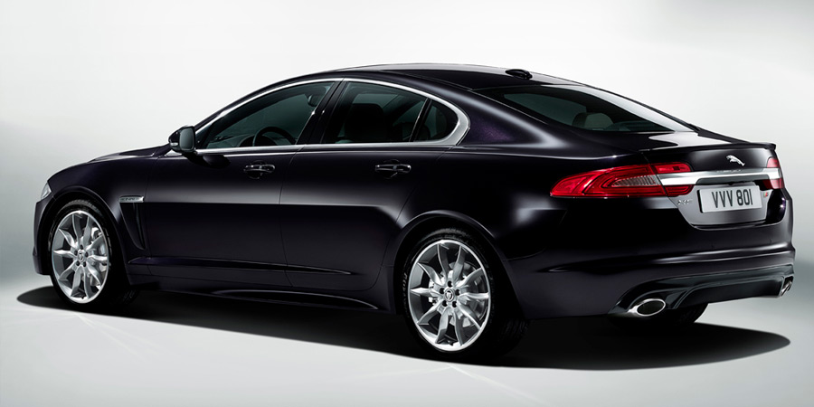
In this blog entry we will be talking about the Jaguar XF, a car I have experienced in person. And boy, is it a beaut.

You might be asking, "Dang, how did you encounter that?" Truthfully, I didn't just run into one. I drove one. And it is everything you and I would hope that it is. It is a piece of art and a thing of beauty. Where to start? 

XF, baby!
Let's start with the exterior. Look at them curves. They are absolutely gorgeous. Smooth and pristine as can be. Now look at the brakelights. Those scream class to me. Or obnoxious, depending on who you ask! Now look at those tires. Shiny chrome. Mmm. The only downside is that the engine is so big. It's a V8 so it packs a punch. This means you have to house said engine, and this requires the driver to inch the car out a little more than he/she may be used to. But on the bright side you get to go fast. Like really fast.

The inside of the baby. A literal baby.
Now let's look at the interior. I can speak from experience using this car, so if a description doesn't make sense, I apologize. I love the steering wheel. It feels great in the hands and is incredibly responsive. It also has paddle shifters (like in racecars) if you're a fan of manual shifting versus automatic. Additionally, the gear shifter is not a stick like you're used to - it's a little circle that you can direct left to right to point to the desired gear (L2, D, R, etc, my terminology may be off). It's really handy but a bit slippery at times, so that could cause problems. Moreover, there are heated seats, a navigation system, and seat shifters. They're all so useful and desirable! However, the navigation system is pretty buggy and not responsive at times. It violates so many user heuristics it's not even funny. It's not intuitive at all. Even my father, who works for Jaguar (or as the Brits say, Jag U Are), says it needs a ton of work.

 
With that image posted, bask in it. Aw yeah. Also, did I mention 0-60 in like three seconds?

Thursday, November 13, 2014

Laundryview

Entry 9, Due 11.13.2014
Terra System
Lindt (I'm really running out of candies) Galaxy
Star Command Went Full Darth Vader and Abandoned Luke :(

Ryan Maas here! I'm here today to talk to you about Laundryview! With three payments of only $19.99 you can enjoy this incredibly useful product! It's better than OxiClean! (Catch my drift?)

Take a look at the site.

Yay Laundryview!
It's everything students need. And that's what it is designed for. It is simple and to the point, and doesn't try to accomplish more than it needs to. It simply tells you the current availability of washers and dryers in each hall/building. This prevents the hassle of walking to your nearest laundry room and finding everything to be taken. I can't stress enough how much time it saves.

Moreover, the solution actually looks nice. It's easy on the eyes and unobtrusive. There's no annoying ads or fancy jQuery functions when you hover over some random element. The navbar is situated right where your eyes hope it should be. The color scheme matches that of Furman for the most part - aside from the yellow - so hooray for school pride? Additionally, there's functionality that allows you to see how much time remains for a given washer or dryer if it is being used. That's something I've always wanted for my washer and dryer at home, and I've got it here, so you could say things are getting pretty serious. 


Wednesday, November 5, 2014

360 is Greater Than One

Entry 8, Due 11.6.2014
Terra System
Yoohoo (OMG A CHOCOLATE DRINK) Galaxy
Star Command Doesn't Even Read My Blogs

Hey look, I can do math (barely). But what do those numbers mean? Ah, yes, I'm referring to the design of the Xbox 360 controller versus that of the new Xbox One. You know, the "improved" version of the 360 controller. Microsoft surely meant inferior. They had to have!

So what made the Xbox 360 controller so great? Well, take a look.

1337 quickscoped
It is ergonomic in shape and the functions of each area are clearly defined. Heck, there's labels above the "Start" and "Select" buttons. Additionally, the joysticks are super smooth, especially if you "wear" them in (like you would a baseball mitt). They just feel right. Moreover, the whole controller layout is comfortable in your hands. You don't have to stretch any fingers to do anything. Plus, the materials that make up the controller are perfect. It's a pretty solid plastic (I think) that doesn't feel scratchy on your hands like some materials do (hello Macbooks). Add in the color coding for button functionality, and you have a piece of hardware that, combined with software, seems quite intuitive.

Now contrast the 360 controller with that of the new Xbox One.

I'm cool guys, I promise.
The first striking difference, besides color, is the angularity of the controller. What once was smooth has become a little rough and angular. Personally, I'm not a fan of this and I think it doesn't look natural.  It doesn't feel natural either, which is the most important thing for a gaming controller. The areas around the joysticks are also inverted as well - what once had rings that rose towards the joysticks now has bevels instead. I'm indifferent towards this change because I don't think the inversion presents much change to the user experience. However, the elimination of text on the controller and fully colored buttons are major changes. From my perspective, it seems likely that Microsoft - shooting for simplicity - may contribute to new users not knowing which button is the start or select button. Unlikely, but it is possible. Additionally, I wonder what effect the elimination of colored buttons has on users. There is a population of colorblind users that use Xbox so it is possible that their experience may be slightly more complicated now, but I'm no expert. I personally don't think that such a change was desirable. However, I will state that the material design of the Xbox logo is a nice touch. Scratch that, it's an amazing touch.

Monday, October 20, 2014

The Barrel of Crackers

Entry 7, Due 10.23.2014
Terra System
Mars Galaxy
Star Command, Get Me My Doritos

In this design entry we will be discussing the design and layout of the Cracker Barrel restaurant, which is synonymous with "heaven on Earth."

What is so brilliant about the design and layout of the Cracker Barrel restaurants? Well, first and foremost, they suck you right in as soon as you step foot out of your car? What's that, you're tired? Here, sit on our rocking chairs for free. You can buy one if you want, they're pretty cool. Nothing says country like wooden rocking chairs. Secondly, once you step in the restaurant, they have you. Boom. You walk into a paradise of old school foods and candies, home-made items, and good ol' country things. This is obviously deliberate - the designer was brilliant to place a store at the front of the restaurant. Moreover, the store is also where you check out. So while you're checking out you can see all those wonderful goodies that you should probably buy (which is exactly what happens!). Thirdly, the whole atmosphere lends credence to the claim "Good country cookin'." The food smells as amazing as it tastes, the staff is polite, and the design of the dining room is so country. The tables are made of wood, there are old-school peg games on each table, the walls are brick or wood and plastered with old timey portraits and items. 

Don't act like you don't want some.


So all in all, they really raise the bar for atmosphere and quality. Cracker Barrel has done a good job of making it a desirable place to be thanks to its layout and design - I mean seriously, having a store where you check out is incredibly savvy-  among other things. Plus people want to use it to shop and eat, and voila, you have a great restaurant on our chain. The only negative for Cracker Barrel, in my opinion, is that they don't deliver. I would be their #1 customer. Cracker Barrel, if you're reading this, please deliver.


Tuesday, October 14, 2014

SALSA OM NOM NOM

Entry 6, Due 10.16.2014
Terra System
Hershey's Galaxy
Star Command Fite me IRL

Today's discussion item is inspired by its presence on my desk at the moment. I'm talkin' 'bout salsa containers, yo!

Bask in its glory!
Yes, the famous salsa container utilized by Tostitos (makers of heavenly tortilla chips that always fall short of restaurant quality but always help my wallet feel great). These things are super useful and are a dominant feature in many "chip" aisles in grocery stores. What makes them so desirable and useful? Firstly, they hit a key demographic of users - those who like their chips with salsa! That's a lot of people (thanks John Madden!). Secondly, the portion sizes seem to be just right. These containers are not too big nor too small - I always feel like I have plenty of salsa when I buy just one container, and that's a good thing. Thirdly, the shape and texture of the containers (plus the top) plays a key part in their reusability. The container is not big and fits perfectly into the door-handle containers (in layman's terms, the parts on the door of your refrigerator). The allows the user to store more items in the fridge. Additionally, the top comes off super easily and the fact that the container is made of glass means that items inside are preserved pretty well, especially if refrigerated.

However, I cannot come to terms with the fact that salsa must be refrigerated. I hate having to reheat things. Why can't I just leave the salsa in the pantry?! It seems to be frowned upon. I digress though - the only problem I can find with the salsa containers is that they help me run out of chips quickly :(

Monday, October 6, 2014

The Frozen Logo

Entry 5, Due 10.9.2014
Terra System
Twix Galaxy
Star Command, Who Can't Even FaZe Clan

Alright, so this entry is inspired by the current jam "Let It Go." But not the version by Idina Menzel; rather, it's a rock cover I found on YouTube, and it's amazing. Anyways, I digress. Our topic will be the Frozen Logo.

The famous logo

Look at it in all its glory. This thing is a masterpiece. What makes it so great? My first impression is "Wow, that looks cold." So the logo is giving the right reaction - the theme of the movie is ice and snow related, so the logo should be heavily related to that. The text itself has a lot of pointed edges, especially near the "F" and the "E." If I were an English major I'd state something like "they symbolize the delicacy and jaggedness of Elsa's self-esteem." Alas, I am not; I am here to critique and compliment the design. Those two letters specifically remind us of icicles, objects we're all familiar with from childhood. They're very dangerous but very impressive works of nature. Moreover, I love the color gradient on the letters themselves. It lends contrast to the background, yet at the same time makes you feel like you're staring at an ice sheet from above. Relatedly, the background gradient is perhaps my favorite part of the whole thing. The light emanating from the center gives off an aura of calm and awe, as if to say "admire from a distance." Plus, like I said before, it really makes you feel like you're staring at a sheet of ice. Where are the fishies though? Finally, the semi-transparent snow/ice-flake in the background is the finishing touch to a work of art. It seems perfectly symmetrical, giving us a feeling of completeness. Weird, because that's what the movie gives me too!

So what is bad about this design? I really don't know, since I'm not a graphic designer. I'm not qualified to make color or lighting critiques. However, my basic critique has been the same one I've had with all Disney logos - the damn "D" in the front. I thought that was a reverse "G" until I was 8 or so, and kept wondering why Disney did that. I was a smart child overall, but that was not a highlight. The color gradient up top, too, looks a little darker than it does on the bottom, but that may just be me nitpicking. I think that it adds a depth to it, but others may not. The beauty of opinion! (Mine's better than yours)