Thursday, December 4, 2014

Blogger #WoahSoMeta

Entry 11, Due 12.4.2014
Terra System
M & M's Galaxy (Santa is real!)
Star Command, It's Been A Good Ride. Spaceship Now Pl0x

For our final entry, we shall be discussing the design of this website. Woah, so meta and spooky! 

So what stands out about utilizing Blogger (or, more colloquially, Blogspot)? Firstly, the ease of setting up is absolutely phenomenal. I had never done a blog before, and I set one up in about thirty seconds. It was so easy a caveman can do it! Secondly, the layout is simplistic and accomplishes a lot with minimal intrusion.


Look how organized it is. All of my options are right there, and similar options are grouped accordingly. Settings are to the right, actions regarding the actual post are top right, the editor is the focus of the screen, and changes to the post content are directly above the editor. In other words, the layout stresses the important aspects of the application, and that's fundamentally an important part of any website. Heck, even pressing the buttons gives the user good feedback, adding to the already solid user experience.

Additionally, the side bar is really quite good. Look:

When you click on any of the tab, all options ease in right underneath the header. In the case of location, a Google Map eases in. Rather than have the options pop off to the left of the headers, which is a possibility, the devs made a conscious choice to let everything ease in underneath. It is unobtrusive and easy on the user's eyes.

So what is bad about Blogger? Truthfully, not much really. The functionality is top-notch and the look is good. It doesn't need to be fancy; it just needs to get the job done well and not look terrible. With that said, I think the homepage needs a little more substance. There is mostly analytics and the option to start a new blog, both of which I think could fit on the editor page. But the user does need various options for actions to take, like writing a new post and whatnot (which is not available on the editor view), so perhaps I'm jumping the gun.

Monday, November 17, 2014

Jag U Are XF

Entry 10, Due 11.20.2014
Terra System
Ghirardellalalalali Galaxy
Star Command! Hi!

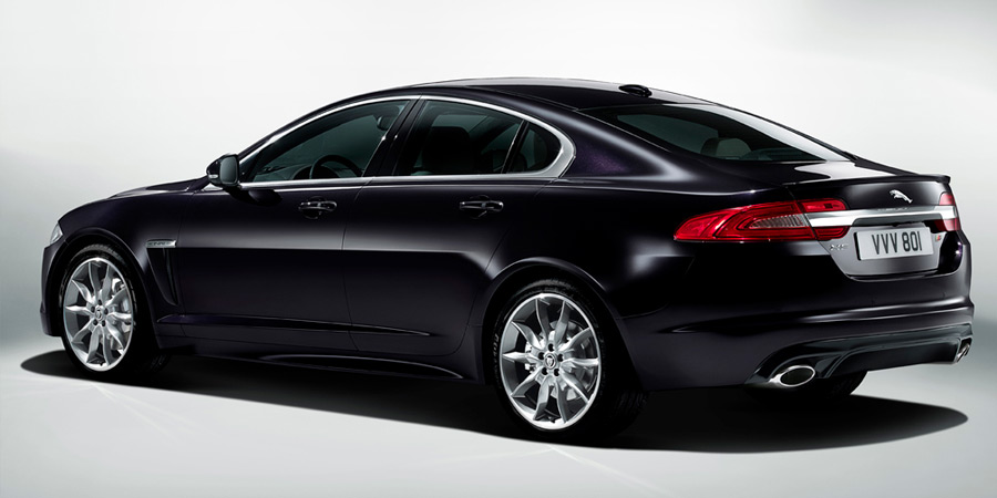
In this blog entry we will be talking about the Jaguar XF, a car I have experienced in person. And boy, is it a beaut.

You might be asking, "Dang, how did you encounter that?" Truthfully, I didn't just run into one. I drove one. And it is everything you and I would hope that it is. It is a piece of art and a thing of beauty. Where to start? 

XF, baby!
Let's start with the exterior. Look at them curves. They are absolutely gorgeous. Smooth and pristine as can be. Now look at the brakelights. Those scream class to me. Or obnoxious, depending on who you ask! Now look at those tires. Shiny chrome. Mmm. The only downside is that the engine is so big. It's a V8 so it packs a punch. This means you have to house said engine, and this requires the driver to inch the car out a little more than he/she may be used to. But on the bright side you get to go fast. Like really fast.

The inside of the baby. A literal baby.
Now let's look at the interior. I can speak from experience using this car, so if a description doesn't make sense, I apologize. I love the steering wheel. It feels great in the hands and is incredibly responsive. It also has paddle shifters (like in racecars) if you're a fan of manual shifting versus automatic. Additionally, the gear shifter is not a stick like you're used to - it's a little circle that you can direct left to right to point to the desired gear (L2, D, R, etc, my terminology may be off). It's really handy but a bit slippery at times, so that could cause problems. Moreover, there are heated seats, a navigation system, and seat shifters. They're all so useful and desirable! However, the navigation system is pretty buggy and not responsive at times. It violates so many user heuristics it's not even funny. It's not intuitive at all. Even my father, who works for Jaguar (or as the Brits say, Jag U Are), says it needs a ton of work.

 
With that image posted, bask in it. Aw yeah. Also, did I mention 0-60 in like three seconds?

Thursday, November 13, 2014

Laundryview

Entry 9, Due 11.13.2014
Terra System
Lindt (I'm really running out of candies) Galaxy
Star Command Went Full Darth Vader and Abandoned Luke :(

Ryan Maas here! I'm here today to talk to you about Laundryview! With three payments of only $19.99 you can enjoy this incredibly useful product! It's better than OxiClean! (Catch my drift?)

Take a look at the site.

Yay Laundryview!
It's everything students need. And that's what it is designed for. It is simple and to the point, and doesn't try to accomplish more than it needs to. It simply tells you the current availability of washers and dryers in each hall/building. This prevents the hassle of walking to your nearest laundry room and finding everything to be taken. I can't stress enough how much time it saves.

Moreover, the solution actually looks nice. It's easy on the eyes and unobtrusive. There's no annoying ads or fancy jQuery functions when you hover over some random element. The navbar is situated right where your eyes hope it should be. The color scheme matches that of Furman for the most part - aside from the yellow - so hooray for school pride? Additionally, there's functionality that allows you to see how much time remains for a given washer or dryer if it is being used. That's something I've always wanted for my washer and dryer at home, and I've got it here, so you could say things are getting pretty serious. 


Wednesday, November 5, 2014

360 is Greater Than One

Entry 8, Due 11.6.2014
Terra System
Yoohoo (OMG A CHOCOLATE DRINK) Galaxy
Star Command Doesn't Even Read My Blogs

Hey look, I can do math (barely). But what do those numbers mean? Ah, yes, I'm referring to the design of the Xbox 360 controller versus that of the new Xbox One. You know, the "improved" version of the 360 controller. Microsoft surely meant inferior. They had to have!

So what made the Xbox 360 controller so great? Well, take a look.

1337 quickscoped
It is ergonomic in shape and the functions of each area are clearly defined. Heck, there's labels above the "Start" and "Select" buttons. Additionally, the joysticks are super smooth, especially if you "wear" them in (like you would a baseball mitt). They just feel right. Moreover, the whole controller layout is comfortable in your hands. You don't have to stretch any fingers to do anything. Plus, the materials that make up the controller are perfect. It's a pretty solid plastic (I think) that doesn't feel scratchy on your hands like some materials do (hello Macbooks). Add in the color coding for button functionality, and you have a piece of hardware that, combined with software, seems quite intuitive.

Now contrast the 360 controller with that of the new Xbox One.

I'm cool guys, I promise.
The first striking difference, besides color, is the angularity of the controller. What once was smooth has become a little rough and angular. Personally, I'm not a fan of this and I think it doesn't look natural.  It doesn't feel natural either, which is the most important thing for a gaming controller. The areas around the joysticks are also inverted as well - what once had rings that rose towards the joysticks now has bevels instead. I'm indifferent towards this change because I don't think the inversion presents much change to the user experience. However, the elimination of text on the controller and fully colored buttons are major changes. From my perspective, it seems likely that Microsoft - shooting for simplicity - may contribute to new users not knowing which button is the start or select button. Unlikely, but it is possible. Additionally, I wonder what effect the elimination of colored buttons has on users. There is a population of colorblind users that use Xbox so it is possible that their experience may be slightly more complicated now, but I'm no expert. I personally don't think that such a change was desirable. However, I will state that the material design of the Xbox logo is a nice touch. Scratch that, it's an amazing touch.

Monday, October 20, 2014

The Barrel of Crackers

Entry 7, Due 10.23.2014
Terra System
Mars Galaxy
Star Command, Get Me My Doritos

In this design entry we will be discussing the design and layout of the Cracker Barrel restaurant, which is synonymous with "heaven on Earth."

What is so brilliant about the design and layout of the Cracker Barrel restaurants? Well, first and foremost, they suck you right in as soon as you step foot out of your car? What's that, you're tired? Here, sit on our rocking chairs for free. You can buy one if you want, they're pretty cool. Nothing says country like wooden rocking chairs. Secondly, once you step in the restaurant, they have you. Boom. You walk into a paradise of old school foods and candies, home-made items, and good ol' country things. This is obviously deliberate - the designer was brilliant to place a store at the front of the restaurant. Moreover, the store is also where you check out. So while you're checking out you can see all those wonderful goodies that you should probably buy (which is exactly what happens!). Thirdly, the whole atmosphere lends credence to the claim "Good country cookin'." The food smells as amazing as it tastes, the staff is polite, and the design of the dining room is so country. The tables are made of wood, there are old-school peg games on each table, the walls are brick or wood and plastered with old timey portraits and items. 

Don't act like you don't want some.


So all in all, they really raise the bar for atmosphere and quality. Cracker Barrel has done a good job of making it a desirable place to be thanks to its layout and design - I mean seriously, having a store where you check out is incredibly savvy-  among other things. Plus people want to use it to shop and eat, and voila, you have a great restaurant on our chain. The only negative for Cracker Barrel, in my opinion, is that they don't deliver. I would be their #1 customer. Cracker Barrel, if you're reading this, please deliver.


Tuesday, October 14, 2014

SALSA OM NOM NOM

Entry 6, Due 10.16.2014
Terra System
Hershey's Galaxy
Star Command Fite me IRL

Today's discussion item is inspired by its presence on my desk at the moment. I'm talkin' 'bout salsa containers, yo!

Bask in its glory!
Yes, the famous salsa container utilized by Tostitos (makers of heavenly tortilla chips that always fall short of restaurant quality but always help my wallet feel great). These things are super useful and are a dominant feature in many "chip" aisles in grocery stores. What makes them so desirable and useful? Firstly, they hit a key demographic of users - those who like their chips with salsa! That's a lot of people (thanks John Madden!). Secondly, the portion sizes seem to be just right. These containers are not too big nor too small - I always feel like I have plenty of salsa when I buy just one container, and that's a good thing. Thirdly, the shape and texture of the containers (plus the top) plays a key part in their reusability. The container is not big and fits perfectly into the door-handle containers (in layman's terms, the parts on the door of your refrigerator). The allows the user to store more items in the fridge. Additionally, the top comes off super easily and the fact that the container is made of glass means that items inside are preserved pretty well, especially if refrigerated.

However, I cannot come to terms with the fact that salsa must be refrigerated. I hate having to reheat things. Why can't I just leave the salsa in the pantry?! It seems to be frowned upon. I digress though - the only problem I can find with the salsa containers is that they help me run out of chips quickly :(

Monday, October 6, 2014

The Frozen Logo

Entry 5, Due 10.9.2014
Terra System
Twix Galaxy
Star Command, Who Can't Even FaZe Clan

Alright, so this entry is inspired by the current jam "Let It Go." But not the version by Idina Menzel; rather, it's a rock cover I found on YouTube, and it's amazing. Anyways, I digress. Our topic will be the Frozen Logo.

The famous logo

Look at it in all its glory. This thing is a masterpiece. What makes it so great? My first impression is "Wow, that looks cold." So the logo is giving the right reaction - the theme of the movie is ice and snow related, so the logo should be heavily related to that. The text itself has a lot of pointed edges, especially near the "F" and the "E." If I were an English major I'd state something like "they symbolize the delicacy and jaggedness of Elsa's self-esteem." Alas, I am not; I am here to critique and compliment the design. Those two letters specifically remind us of icicles, objects we're all familiar with from childhood. They're very dangerous but very impressive works of nature. Moreover, I love the color gradient on the letters themselves. It lends contrast to the background, yet at the same time makes you feel like you're staring at an ice sheet from above. Relatedly, the background gradient is perhaps my favorite part of the whole thing. The light emanating from the center gives off an aura of calm and awe, as if to say "admire from a distance." Plus, like I said before, it really makes you feel like you're staring at a sheet of ice. Where are the fishies though? Finally, the semi-transparent snow/ice-flake in the background is the finishing touch to a work of art. It seems perfectly symmetrical, giving us a feeling of completeness. Weird, because that's what the movie gives me too!

So what is bad about this design? I really don't know, since I'm not a graphic designer. I'm not qualified to make color or lighting critiques. However, my basic critique has been the same one I've had with all Disney logos - the damn "D" in the front. I thought that was a reverse "G" until I was 8 or so, and kept wondering why Disney did that. I was a smart child overall, but that was not a highlight. The color gradient up top, too, looks a little darker than it does on the bottom, but that may just be me nitpicking. I think that it adds a depth to it, but others may not. The beauty of opinion! (Mine's better than yours)


Sunday, September 28, 2014

Gameboy Advance SP

Entry 5, Due 10.2.2014
Terra System
York Galaxy
Star Command, aka Procrastinators Inc.

In this design blog we will discuss the Gameboy Advance SP, the childhood wonder itself!

Nintendo released the Gameboy Advance SP in February 2003, and have currently sold about 43.54 million units. This is due to a combination of a relatively low price, featured games, and a unique backlighting feature that was pretty revolutionary. Let's delve into what makes the SP awesome.

The SP has a lot of great features. All the edges are curved, meaning that children should - that's the key word - not be able to hurt themselves with it. It feels really smooth and can fit into your pocket since it folds in half. There is a wide selection of colors for the platform too. And we all know little children love their colors! Additionally, the selection of games for the SP is gigantic. The SP supports both regular Gameboy Color cartridges as well as Game Boy advance cartridges, so there is backwards compatibility present. Moreover, Nintendo implemented a backlight feature in the SP that allows the screen to light up. In other words, you could play the game in the dark! It was a welcome addition and allowed kids to play Pokemon at night without turning the lights on. 

The glory itself.
What cons did the SP have? The only one I remember as a child is that the battery would die more quickly if you left the backlight on. The SP did come with a charger - signifying a transition from the standard AA battery power source that was so typical of 90s/early 2000s devices. Nintendo did a really great job with the SP - they made desirable changes for an audience that craved for useful additions. Plus Nintendo and Pokemon are amazing, so that works out well.

Wednesday, September 24, 2014

The Good "Old" Xbox 360

Entry 4, Due 9.25.2014
Terra System
Reese's Galaxy
Star Command, Do You Even Respond?

In this week's entry we will be discussing the loved and despised Xbox 360. The Real MVP.

The Xbox 360 is a Microsoft product that succeeded it's predecessor, the Xbox, and allowed Microsoft to emerge as a serious player in the gaming industry. It came out in 2005 and competes primarily with the PlayStation3 and Nintendo Wii (bleh). It currently sits as the sixth-best selling system of all time, with a sales number of 84 million. 

So what makes the 360 such an attractive piece of technology? For one, it has a simple design. It is flat and can fit almost anywhere, which is perfect for users who either want it to sit horizontally or stand vertically. If you have a space that needs filling, the 360 could probably fit. Secondly, it has an exhaustive array of games to select from. It has Halo 3, the best selling game of 2007 (and probably my favorite game of all time), as an exclusive title (meaning Sony couldn't have it on its POS3). It has all of the EA series of games like Battlefield, Madden, NHL, etc. It has the Gears of War and Left 4 Dead series, both highly successful franchises. Finally, it has Xbox Live at its disposal. Xbox Live is Microsoft's implementation of multiplayer gaming and interaction, and it's pretty dang great. The security of the infrastructure is quite high - servers don't get taken down ala Sony - and the multiplayer population is gigantic. There's currently 148 million Xbox Live members!

The glory hunter itself/

With that said, we have to investigate its shortcomings. There aren't many, but the ones it possesses are pretty severe. The Xbox 360 has a lot of usability problems regarding the "Red Ring of Death." When this occurs, your Xbox is kapeesh. This signifies hardware problems with more than one hardware component, and your Xbox won't even give you an error message. Additionally, the e74 error is pretty common as well. This error signifies a problem with the scaler chip in the Xbox. I've had this error and couldn't fix it...little did I know, Microsoft offers a three year warranty with each Xbox regarding this error as of April 2009. That would've helped me. Moreover, the overall failure rate of this system is expected to be about 23%. That's really high, especially for a system that represents such a big investment.

The Red Ring of Death.


We haven't heard of such problems with the Xbox One, so we'll see how that ends up!

Wednesday, September 17, 2014

Airplane Trays!

Entry 3, Due 9.18.2014
Terra System
Baby Ruth Galaxy
Star Command, You Da Real MVP.

In this week's design entry we will be briefly discussing the design of airplane tray tables. You know, those cool things on the back of seats in airplanes.

First and foremost, why do we need these? Or better yet, why are they useful? Well, these are simple questions with an obvious answer - they're great for our leisure while we fly from destination to destination. They can safely hold cups of liquids and are a good location to place your laptop if you need to get work done while you're flying. So, that settles the question of usability - tray tables are entirely useful and sometimes necessary for certain people. There are also a few safety measures associated with these, such as making sure they're upright before liftoff and landing. But what about the design of these tray tables?

These tables tend to be simplistic in design across all carriers - there is little to no difference among tray tables on Delta, United, American Airlines, and other carriers. They're usually grey in color and have rounded edges so as to prevent clumsy user injury. They also have a small, circular cup-holder that is not particularly deep (mostly due to the overall small thickness of the tray table). 


                                                         Simple image of a tray table.
So we've implicitly briefly touched upon the positive aspects of the design of airplane tray tables. Now we must ask, are there any bad aspects of the tray table, design or functionality-wise? One bothersome thing to me is just the safety measure of having flight attendants bother you until you put up your tray table. That's a major implementation con, in my opinion, but it's a rather necessary one. Additionally, I think that the tray tables may be a little too thin and too flimsy. A little turbulence shakes it up and could make your laptop or soda fall to the ground. But again, I also find the thickness necessary as well - there's only so much space the designers have to work with.

All in all, I personally love these little buggers. They're convenient, not an eyesore, and get the job done. I just wish I could say the same about their carriers leaving on time.

Thursday, September 11, 2014

OMG APPLE

Captain's Log

Diversionary Entry
Terra System
Kit Kat Galaxy
Star Command! Come in Star Command!

In this brief entry I will be discussing the thoroughly engaging performance put on by Apple regarding their new iPhone 6 and the Watch. There is some sarcasm in that sentence.

Firstly, the presentation was not the greatest. The British announcer had a weird way of enunciating things,and a lot of the comments were weird. I mean seriously, a watch allowing someone "to connect intimately with others?" It tried a little too hard to convince us to buy these products.

But alas, the purpose of this post is about the design of the products, not the design and implementation of their presentation and unveiling. I feel like I critiqued a previous iteration of the iPhone in a previous post, so doing so would feel repetitive. I'll discuss the new Watch instead.

It's an interesting concept, one that follows the progress of their competitors. Smartphone-esque watches are now a big deal, or at least that's the current trend. With the new Watch, users will be able to use apps, but just on their watch. The implementation of selecting the apps - by zooming in on a certain region - was pretty wizard and a great achievement. I really like that, I think it is a great way to overcome the challenge of limited screen real-estate while still maintain solid functionality. 

On the flip side, I really have to question why you would ever want a $300 Apple Watch. For that price you might as well buy a really fancy watch, I would think. The Watch seems too repetitive in terms of functionality - it does all that the iPhone does, as far as I know, except that it sits on your wrist. And you still need the iPhone to make calls at the end of the day, so if you want the Watch, you should probably have an iPhone. Pretty hefty investment for something that seems to mostly be about making a statement, saying "I have the Watch and it has sapphire in it," rather than something that truly distinguishes it from it's technological family tree. I mean the Watch is cool, and it looks REALLY nice (the immense personalization is awesome), but it just seems like an iPhone accessory rather than its own product. 

At the end of the day though, it doesn't really matter. Apple will still roll in the dough no matter what the common perception of their product lineup is.


Wednesday, September 10, 2014


Captain's Log

Entry 2, Due 9.11.2014
Terra System
Three Musketeers Galaxy
Star Command, What R U Doin'?

 This week's topic will be MySpace! You want in on my top eight spaces? Ha, just kidding, MySpace sucks. I'll be talking about Facebook instead.

Facebook is a very solid website that gets a lot done, and it does it well. I really don't think I need to elaborate what Facebook does, unless you live under a rock ala Patrick Star, but here's a few simple things it enables users to do: share videos, play games together, correspond in groups, utilize polls, follow celebrities (or their PR people, I suppose), and keep up to date with friends in different parts of the United States or the world. It's a hefty application. It also looks very nice - it has a simple layout and is not too visually intrusive, in my opinion. It has a consistent blue theme that doesn't assault your eyes, and everything is very intuitive - even the most oblivious users should be able to get a task done very easily. The layout is catered to be simplistic and effective, with most options to the left, current friends online to the right, and your "news feed" in the center, which you may or may not actually care about. I sometimes scour it for interesting things, but often it's nonsense or political banter that will cause me to bash my head in. So I avoid that.

                                                               Basic overview for Patrick Star

Nevertheless, I digress. Facebook does have its cons as well. The whole gaming section? It's really annoying getting invites from people when you don't even play games on Facebook. Like seriously, buzz off. Additionally, the mobile version of the site is bad, especially if you don't want to install the Facebook application. It has incredibly limited functionality and looks especially bad. You can't even upload photos from your phone via the mobile site! Moreover, every time you visit Facebook on a mobile device, they push you to install Facebook Messenger. And by push, I mean DO YOU WANT THIS APP ARE YOU SURE YOU DON'T PLEASE DOWNLOAD THIS APP. It's that annoying. Nonstop advertising of their own product pisses me off, but I can see why they do it. I just wish they'd stop - we know the app exists, you're not going to convince me to download it just to message people. That's why I have a phone in the first place - to text and/or call people. Duplicating functionality is a waste of my time, in my opinion. There's no need to reinvent the wheel.

I'm sure there are different complaints others have, especially regarding functionality and appearance, but I'm limiting my post to those.

Space Ranger Ryan out.

Wednesday, September 3, 2014

Captain's Log

Entry 1, Due 9.4.2014
Terra System
Milky Way Galaxy
Star Command is MIA

This week's topic will be the iPhone 5. It is new, sleek, and commonplace. It is a good item to bash if you're an Android fanboy like myself, and a good item to support if you eat Apples all day.

Nevertheless, I digress. What do I think about the iPhone 5? There are a lot of great features, from the incorporation of material design in the user interface to the sleekness of the phone. It looks good and it feels good. The interactions are intuitive, for the most part, and the software gets the job done.

The iPhone 5 is easily usable, enjoyable, and especially useful. It meets the basic requirements that many people ask of in a modern smartphones, such as text messaging and calling, but it innovates on some of them too. You can talk and text at the same time! That's very cool. Apple also recently implemented a process manager similar to that on the Android OS in that a user can now view open/running applications and close the ones they need to with one swipe. Neat stuff.

But what about the downsides? The new charging port is a pain, to say the least. Apple consciously made the decision knowing that the bandwagon would follow, and that's not a bad thing. It's just weird that all other iterations of the iPhone use the same type of charger and that this one uses one that is entirely incompatible with the rest of the lineup. The port looks weird, almost like it belongs to a MicroSD card or something. Additionally, it took Apple until 2014 to implement the aforementioned Application Manager. The Android OS has had that forever. Is that Apple admitting that the user experience of previous iPhone generations was subpar to that of Android users, or is it simply acknowledging that its competitor had an innovation that should be followed? Most likely the latter. Getting to the "Running Apps" tab in previous iterations was a hassle and not entirely intuitive for basic users. Now it's a breeze, so a big thumbs up to Apple.

                                                             Example of the new charger


All in all, I do very much like the look of the iPhone 5. It's easy to use and the innovative calling feature is quite cool. I wish my Android had that functionality. However, I'm on board with the backwards compatibility bandwagon for slow-to-upgrade users like myself, so I'm skeptical of Apple implementing a new charger. Will they phase out the old chargers, thus isolating a large demographic of users (iPhone 4 especially)? I'd like to think not. Then again, they're the business wizards and I am a lowly student blogging about them. Perhaps I should ask them to be the honorary armchair CEO.